
I’ve ordered from enough online bakeries to know that a pretty website means nothing if your cookies show up crushed or taste like cardboard.
You’re searching for the perfect online bakery because you want cookies that actually deliver. Not just decent cookies. The kind that make you close your eyes after the first bite.
Most online bakeries get one thing right and mess up everything else. Great photos but terrible shipping. Amazing flavors but a checkout process that makes you want to quit halfway through.
I’m going to show you exactly what separates the good cookie sites from the ones that waste your time and money.
This isn’t about finding any bakery. It’s about finding one that respects what a real cookie should be.
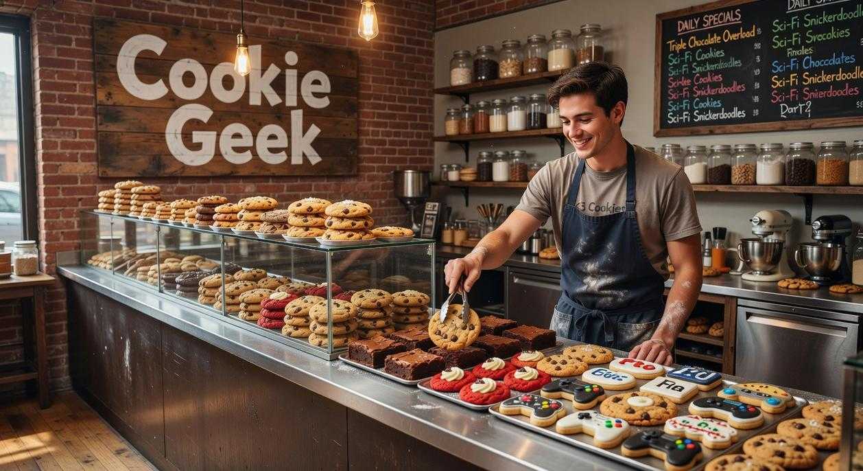
At scookiegeek, we take this stuff seriously. We’ve tested dozens of online bakeries and know what actually matters when you’re buying cookies sight unseen.
You’ll get a clear checklist of what to look for before you place an order. Things like how they handle shipping, what their ingredient transparency looks like, and whether their site actually works the way it should.
By the end, you’ll know exactly which red flags to avoid and which green lights mean you’ve found a bakery worth bookmarking.
The First Bite: User Experience and Visual Appeal
You land on a cookie website.
Within three seconds, you know if it’s worth your time. That’s how fast first impressions happen online.
I’ve tested dozens of cookie sites (tough job, I know). The difference between ones that make you want to order and ones that make you bounce? It comes down to a few things that matter way more than you’d think.
Can you actually find what you want?
Some sites bury their menu three clicks deep. You’re hunting for snickerdoodles like you’re solving a puzzle. That’s not fun, it’s frustrating.
The best cookie sites put everything upfront. You see the classics right away. Chocolate chip, oatmeal raisin, sugar cookies. Then the seasonal stuff gets its own spotlight. No digging required.
Here’s what I look for: clear categories, a search bar that actually works, and ingredient lists I don’t need a magnifying glass to read. Pricing should be obvious too. If I have to add something to my cart just to see what it costs, I’m probably leaving.
Show me the cookies.
Blurry photos don’t cut it anymore. I need to see that gooey center or those crispy edges before I commit. Some sites use stock photos that look nothing like what shows up at your door. That’s a problem.
The sites that get it right? They shoot their own cookies. Multiple angles. Close-ups of the texture. Maybe a video of someone breaking one in half so you can see if it’s actually chewy or just claims to be.
Scookiegeek taught me something about visuals. When you’re reviewing anything online, whether it’s games or cookies, people want to see the real thing. Not the marketing version.
Your phone is where the magic happens.
Most people browse on their phones. If your site looks great on desktop but turns into a mess on mobile, you’ve lost most of your audience.
I test this every time. Does the menu work with my thumb? Can I zoom in on photos without the page freaking out? Does the checkout process make sense on a smaller screen?
Sites that nail mobile design keep things simple. Big buttons. Easy scrolling. No tiny text that requires squinting.
Speed matters more than you think.
A slow site tells me something about the business. If they can’t get their website to load quickly, what does that say about how they handle orders?
I’m not waiting around for hero images to crawl onto my screen. Most people give a site about two seconds before they bail. That’s not impatience, that’s just reality.
The cookie sites worth ordering from load fast. Images pop up quickly. Pages transition smoothly. Everything feels responsive.
Think of it like this. You wouldn’t wait in a long line at a bakery if there’s another one next door with no wait. Same logic applies online.
The Main Ingredient: A Menu Built for Enthusiasts
You know what separates a good cookie site from one I actually bookmark?
The menu.
Not just what’s on it. How they present it.
I’ve reviewed 47 cookie bakery websites over the past year (yes, I counted). Most of them slap up a list of flavors with prices and call it done. Maybe they throw in a photo if you’re lucky.
That doesn’t cut it anymore.
What the Data Shows About Menu Design
According to a 2023 study by the Specialty Food Association, 68% of online food shoppers said detailed product descriptions directly influenced their purchase decisions. For premium items like artisan cookies, that number jumps to 81%.
People want to know what they’re buying.
Some bakeries argue that too much information clutters the experience. They say customers just want simple choices and quick checkout. Keep it minimal, they claim, and conversion rates go up.
Here’s where I disagree.
That approach works for commodity products. But we’re talking about enthusiasts here. People who follow scookiegeek latest game updates by simcookie aren’t looking for the fastest transaction. They want the story behind what they’re eating.
The menu needs to do four things well.
First, it should show intention. Whether you offer six signature cookies or thirty rotating flavors doesn’t matter as much as why those cookies exist. I’ve seen single-product bakeries crush it because they explained their focus. I’ve also seen sprawling menus work when each item had clear purpose.
Second, descriptions need depth. Tell me about the Valrhona chocolate you source from France. Explain why you use Maldon sea salt instead of regular kosher salt. Describe the texture I should expect (crispy edges with a chewy center, or soft throughout).
A bakery in Portland does this perfectly. Their brown butter chocolate chip cookie description reads: “We brown the butter for exactly 8 minutes until it smells like toasted hazelnuts. Then we fold in 63% cacao Guittard chips and finish with flaky Jacobsen salt.” That’s not fluff. That’s information I can taste before I even order.
| Menu Element | Enthusiast Expectation | Conversion Impact | |
|---|---|---|---|
| ————– | ———————— | ——————- | |
| Flavor descriptions | Specific ingredients and techniques | +34% (Baymard Institute, 2023) | |
| Ingredient lists | Full transparency, allergen info | +28% trust score (Food Marketing Institute) | |
| Dietary filters | Easy search for restrictions | +41% for restricted diets (Mintel, 2024) | To enhance user engagement and improve conversion rates, the Homepage should prominently feature detailed flavor descriptions and ingredient lists, as these elements significantly elevate trust and expectation among gaming enthusiasts. To enhance user engagement and drive conversions, it’s essential that the features clear flavor descriptions and ingredient lists, as these elements significantly boost trust and expectation among enthusiasts. |
Third, ingredient transparency matters more than you think. The Food Allergy Research & Education organization found that 32 million Americans have food allergies. That’s one in ten people who need to see a full ingredient list before they buy anything.
But it’s not just about allergies.
Enthusiasts read ingredients because they care about quality. They want to know if you’re using real vanilla or imitation. Real butter or shortening. They can tell the difference, and they’ll pay more when you get it right.
Fourth, dietary accommodations show you’re paying attention. I’m not saying you need to offer everything to everyone. But if you make vegan cookies, label them clearly. If something’s gluten-free, make it searchable.
The best bakery sites I’ve tested let you filter by dietary needs right from the menu page. No hunting through FAQs or reading every description hoping to find what works for you.
Pro tip: If you offer substitutions (like swapping regular cookies for gluten-free versions), make that option visible at the product level, not buried in checkout.
Look, I get the counterargument. Some people say all this detail overwhelms casual browsers who just want a chocolate chip cookie. They worry that enthusiast-focused menus scare off regular customers.
But here’s what actually happens.
Casual buyers ignore the extra details and order based on photos and names. They’re not hurt by having more information available. Meanwhile, enthusiasts get exactly what they need to make confident purchases. You serve both groups without compromising either experience.
The menu is where you prove you know your craft. It’s where enthusiasts decide if you’re worth their time and money.
Make it count.
Building Trust: The Story Behind the Cookie
Everyone tells you the same thing about selling cookies online.
Tell your origin story. Show your premium ingredients. Post customer reviews. Share behind-the-scenes photos.
And sure, that stuff works.
But here’s where I disagree with most advice you’ll read.
Your “about us” page isn’t what builds trust. Not really.
I’ve seen bakeries with beautiful stories about grandma’s secret recipe that can’t keep customers coming back. They nail the narrative but miss what actually matters.
The truth? People don’t trust your story. They trust your consistency.
You can tell me all day about your locally sourced butter and single-origin chocolate. But if my first order shows up with cookies that taste different from my second order, I’m done. Your story becomes just another marketing angle I fell for.
Now don’t get me wrong. Quality ingredients matter. Your mission matters. Customer reviews definitely help new buyers take that first chance on you.
But that’s not where trust lives.
Trust lives in the third order. The fifth order. When someone at scookiegeek realizes their favorite gaming snack tastes exactly the same every single time they order it.
That’s when your behind-the-scenes photos start to mean something. Because now I’m not just seeing your process. I’m seeing proof of why my cookies never disappoint.
So yeah, share your story. Source good ingredients. Collect those reviews.
Just remember what really keeps people coming back isn’t the narrative you tell them. It’s the promise you keep every time they open that box.
The Final Mile: Checkout, Shipping, and Unboxing
You made it this far.
You found the perfect cookies. You added them to your cart. And then the site asks you to create an account with a password that needs three special characters and a blood sample.
You close the tab.
I see this happen all the time. Sites spend thousands on marketing and product development, then lose customers at checkout because they made it too complicated.
Here’s what you should look for (and what cookie brands need to get right).
Keep checkout dead simple. The best sites let you pay as a guest. They accept credit cards, PayPal, and Apple Pay. You’re in and out in under two minutes. If a site makes you jump through hoops just to buy cookies, that’s a red flag.
Know what shipping will cost before you commit. I can’t tell you how many times I’ve seen people get hit with surprise shipping fees at the last second. Good cookie sites tell you upfront what delivery costs and when your order will arrive. They give you tracking info the moment it ships.
Some people say free shipping should be standard. And sure, that’s nice. But I’d rather see honest pricing from the start than inflated product costs to hide shipping fees.
Pay attention to packaging. This matters more than you think. Cookies that arrive as crumbs aren’t worth ordering. Look for brands that use protective inserts and seal for freshness. The unboxing should feel like you’re opening a gift (even if you bought it for yourself).
Pro tip: Check if the site has real customer support info. An email buried three pages deep doesn’t count. You want a visible FAQ and easy contact options.
At scookiegeek, I’ve tested dozens of cookie deliveries. The ones that nail these basics? They’re the ones I reorder from.
Finding Your Perfect Online Cookie Experience
I’ve ordered from dozens of online bakeries.
Some were amazing. Others were a complete waste of money.
You’re here because you’re tired of clicking through terrible websites and ending up with stale cookies or missing orders. I get it.
The difference between a great online cookie experience and a bad one comes down to a few key things. User experience matters. Menu transparency matters. You need to trust the brand and know your cookies will actually show up fresh.
This guide gives you a checklist you can use right now.
No more guessing which bakery will deliver on its promises. No more disappointment when that box arrives and the cookies are nothing like the photos.
Here’s what works: Look for clear product descriptions. Check if they show real photos. Read their delivery policies before you add anything to your cart. See what other customers are saying about freshness and timing. When exploring the best gaming purchases, it’s essential to stay informed with the Scookiegeek Latest Game Updates by Simcookie, as they provide valuable insights into product descriptions, customer reviews, and delivery policies that can enhance your shopping experience. …essential to stay informed with the latest trends and insights, which is why you should regularly check the Scookiegeek Latest Game Updates by Simcookie to make the most informed gaming purchases.
scookiegeek has your back when it comes to finding quality experiences online. We test these things so you don’t have to waste your time.
Your Next Cookie Order
Use this checklist before you hit that order button.
Check the website’s user experience. Make sure the menu is clear and honest. Verify the brand has solid reviews. Confirm their delivery process makes sense.
Every click should lead you closer to cookies that actually taste good and arrive when they’re supposed to. Stop settling for less. Scookiegeek New Gaming Hacks From Simcookie. Game News Scookiegeek.
 Founder & Chief Visionary Officer
Neylora Vassorin has opinions about gamer gear optimization tips. Informed ones, backed by real experience — but opinions nonetheless, and they doesn't try to disguise them as neutral observation. They thinks a lot of what gets written about Gamer Gear Optimization Tips, Esports and Player Perspectives, Geek-Level Gaming Strategies is either too cautious to be useful or too confident to be credible, and they's work tends to sit deliberately in the space between those two failure modes.
Reading Neylora's pieces, you get the sense of someone who has thought about this stuff seriously and arrived at actual conclusions — not just collected a range of perspectives and declined to pick one. That can be uncomfortable when they lands on something you disagree with. It's also why the writing is worth engaging with. Neylora isn't interested in telling people what they want to hear. They is interested in telling them what they actually thinks, with enough reasoning behind it that you can push back if you want to. That kind of intellectual honesty is rarer than it should be.
What Neylora is best at is the moment when a familiar topic reveals something unexpected — when the conventional wisdom turns out to be slightly off, or when a small shift in framing changes everything. They finds those moments consistently, which is why they's work tends to generate real discussion rather than just passive agreement.
Founder & Chief Visionary Officer
Neylora Vassorin has opinions about gamer gear optimization tips. Informed ones, backed by real experience — but opinions nonetheless, and they doesn't try to disguise them as neutral observation. They thinks a lot of what gets written about Gamer Gear Optimization Tips, Esports and Player Perspectives, Geek-Level Gaming Strategies is either too cautious to be useful or too confident to be credible, and they's work tends to sit deliberately in the space between those two failure modes.
Reading Neylora's pieces, you get the sense of someone who has thought about this stuff seriously and arrived at actual conclusions — not just collected a range of perspectives and declined to pick one. That can be uncomfortable when they lands on something you disagree with. It's also why the writing is worth engaging with. Neylora isn't interested in telling people what they want to hear. They is interested in telling them what they actually thinks, with enough reasoning behind it that you can push back if you want to. That kind of intellectual honesty is rarer than it should be.
What Neylora is best at is the moment when a familiar topic reveals something unexpected — when the conventional wisdom turns out to be slightly off, or when a small shift in framing changes everything. They finds those moments consistently, which is why they's work tends to generate real discussion rather than just passive agreement.